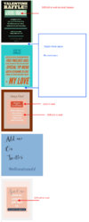
Im trying to put images into my bio. I used this code but the image shows up over top of my cam feed and it is huge.. how can i make it stay down in my bio and put other images below the first one....?
Thanks so much
The best approach is wrapping all your images into a single parent element and make them all responsive.
Unfortunately Chaturbate is delivering images via proxy so the url of your images are nasty (a long string of alphanumeric characters) so I can not provide you with copy/paste markup code but it should look like this.
<p style="display:block;width:100%;height:auto;padding:0;line-height:normal;margin:120px auto 50px -146px;">
<img src="your-image-url-here" style="display:block;width:100%;height:auto;margin:0 auto;"/><img src="your-image-url-here" style="display:block;width:100%;height:auto;margin:0 auto;"/><img src="your-image-url-here" style="display:block;width:100%;height:auto;margin:0 auto;"/><img src="your-image-url-here" style="display:block;width:100%;height:auto;margin:0 auto;"/><img src="your-image-url-here" style="display:block;width:100%;height:auto;margin:0 auto;"/></p>
Now... a few pointers... as you can see I did not use any spaces (backspace or enter) between images because it will be interpreted as <br/> and upon saving the images will have an empty space (white space/gap) between them.
Using 100% width for images will make them responsive but DO use decent size (I'd recommend around 1000px width) because right now all your images look very small, a bit difficult to read the content.
Make all your images same width size (optional and recommended). Avoid using white text on top of a lite background graphic or image (see the screenshot below)

If you need help, let me know and I will throw some tips on how to use different font combinations... because not all fonts look good in certain combinations. For example Join Club section is using a good font combo.
Bold heavy fonts are used for titles. A calligraphic font (which is more feminine script type does not work superb with a bold text below) reference at Spoil Me.
On Add Me on Twitter, you can balance the section by adding the twitter bird in the right empty space next to the dark text ...
Please don't take my suggestions as criticism because they are not. I only make suggestions so you can take full advantage of your Bio page.


