Okay, First off, the browser. I loaded it in Chrome, Firefox, Opera, TorBrowser, Edge, K-Meleon, and SeaMonkey. They all looked the same, everything loaded okay.
The feedback. I like the color palette. The extra little graphics are cute and whimsical. The font and size I think might be a problem. I have my monitors resolutions set at 1920x1080. At 100% zoom in Chrome it makes the main text a bit on the small side. It's readable, it's just going to be a bit of a strain to go through all of that. I had to zoom in to 150% to not have to squint and get closer to the monitor.
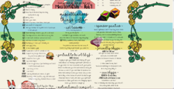
Here's one screen shot, hopefully you can see what I see when looking at it from this resolution

The font is borderline difficult to read. At the very least I would change the font on the section headers. Introduction, About me, Tip menu, games... those. That font is a bit harder to read. The section that is 'pretend to be inl ld gf' i can't tell for sure what that even says. I get it from context of that section, but just reading that by itself; no.
The overall layout. It crams a lot into that width. Instead of 3 columns wide of text, I'd consider two. That would help make it less 'full' of text all being crammed onto the reader at once. But more importantly that would allow you to spread out the text and make the font a bit bigger. Two solutions in one step that way.
Also, I noticed you have that all as one single graphic for most all of the items you can tip for. Might not hurt to break that up into multiple. Have one for your Introduction and About Me still. But move them so Introduction is on top, then About Me below. Mainly to make it one column so you can increase the font.
Another section just for tip menu. Another for games. Another for other things you sell. That would allow you to vary up the layout a bit in each section. Games you could make a single width section, so as you scroll down there's a clear divider between it and the rest. Tip menu you have enough items on there to do two columns all by itself. So that would also make it a bit easier to read and let it stand out more. Maybe use the little graphics as section dividers.
By switching to two columns, or one as needed, and making multiple graphics it would make it longer. But I think much more readable.
The main flower/stem graphic that stays on the page. The one on the right. Can you mirror that vertically so the stem going off to the right at the top goes to the left? That would end the width of the page itself at the main vertical part of the stem instead of having to be clear out there at the right making the page wider for only white space. I think that alone would allow for the page to display a bit wider for the main text part. By reversing that around you are also creating a more flowing top border that is symmetrically matching the left half flower/stem. It would make it a bit more pleasing to the eye for a border.
The twitter, offline tip, and amazon wishlist graphics. Those kind of got lost in the crowd of all the other little graphics. It was several scrolls up and down before I noticed them specifically as link graphics. I would suggest moving the text under the graphic and changing the font to something completely different for each of those. That should help set them off as a separate noticeable item. Also I noticed only the text on those is clickable, not the graphic itself. By creating each graphic and text, then saving it as a single graphic all together, you could then place that on there and link the whole thing (graphic and text) as a single clickable link.
And a side note. I have a multi-monitor setup. So as a last little thing I checked what it looked like extended out wider than one monitor. At first it looks like your background flower/stem/color lines repeat.

But as you scroll down you notice it made the entire page two columns. Not sure if you wanted it to do that or just have it all as one main page column.

TL;DR Mostly the font and font size. And then move around the layout so not so much is trying to be crammed in width wise. Divide up the info into smaller manageable sections each with a slight variation to set them apart.
 http://www.mfc.im/Zhanoodle


