AmberCutie's Forum
An adult community for cam models and members to discuss all the things!
New apps auto-scrolling feature / anyway to disable it?
- Thread starter Epitome_XxX
- Start date
-
** WARNING - ACF CONTAINS ADULT CONTENT **Only persons aged 18 or over may read or post to the forums, without regard to whether an adult actually owns the registration or parental/guardian permission. AmberCutie's Forum (ACF) is for use by adults only and contains adult content. By continuing to use this site you are confirming that you are at least 18 years of age.
- Status
- Not open for further replies.
Solution
You can turn it off, it only affects your view - if the model changes this setting it doesnt do it to you.
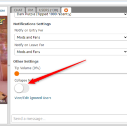
In the CB window under where you can swap to theater/fullscreen it says:
Long app notices now auto-collapse in chat for a cleaner, more focused chat experience with other users. You can toggle this feature on/off in the chat settings tab

In the CB window under where you can swap to theater/fullscreen it says:
Long app notices now auto-collapse in chat for a cleaner, more focused chat experience with other users. You can toggle this feature on/off in the chat settings tab
I seen that this morning and thought WTF is going on ))
I don't see an option for Users to enable / disable it. It would be cool if it was Off by default and have an option to enable it if desired.
I like the border radius they have put around the rectangle background color blocks, I am a fan of rounded corners ))
ETA: I see that have a little arrow you can click to expand / collapse each scrolling block. If they could get setting that to apply to every scrolling block globally it would be useful.
Seq.
Last edited:
Upvote
0
I noticed that last night. Seems like a bit of a nightmare. I can't help but think it will have an impact on models because tip menus are now shown in a tiny window which is auto-scrolling.
Upvote
0
Maybe I missed it, or they added this recently, but you can now disable the scrolly menus in the Chat Settings.
Seq.
Seq.
Upvote
0
You can turn it off, it only affects your view - if the model changes this setting it doesnt do it to you.

In the CB window under where you can swap to theater/fullscreen it says:
Long app notices now auto-collapse in chat for a cleaner, more focused chat experience with other users. You can toggle this feature on/off in the chat settings tab

In the CB window under where you can swap to theater/fullscreen it says:
Long app notices now auto-collapse in chat for a cleaner, more focused chat experience with other users. You can toggle this feature on/off in the chat settings tab
Upvote
0
Solution
Thanks was really annoying, I woke up from a drunk night and these moving menus made me more dizzy.
Upvote
0
The screenshot you posted, is that what you see from a "non-model" account? I'm asking from the "model-side", i don't think i see that option.
Upvote
0
Edit: i see it now. Thanks, so much. You are the GOAT. It's was not a fun exp. seeing letters and numbers constantly rolling up on repeat. Great job CB, for giving an option to not have it do this, from both ends. Excellent. Thanks.The screenshot you posted, is that what you see from a "non-model" account? I'm asking from the "model-side", i don't think i see that option.
Upvote
0
Also, noticed they put a notification, as well. Didn't see this yesterday, from the "customer-side":
"Long app notices now auto-collapse in chat for a cleaner, more focused chat experience with other users. You can toggle this feature on/off in the chat settings tab. (dismiss this message)"
Cool.
"Long app notices now auto-collapse in chat for a cleaner, more focused chat experience with other users. You can toggle this feature on/off in the chat settings tab. (dismiss this message)"
Cool.
Upvote
0
You can turn it off, it only affects your view - if the model changes this setting it doesnt do it to you.
View attachment 99490
In the CB window under where you can swap to theater/fullscreen it says:
Long app notices now auto-collapse in chat for a cleaner, more focused chat experience with other users. You can toggle this feature on/off in the chat settings tab
Off-topic, but, quick question. What editing program has cool arrows like that, always wondered. "MS Paint" has a pretty boring arrow.
Thanks.
Upvote
0
I had it on the regular site as well, in the line between the videofeed and bioIt's weird, you can only see the announcement of the new feature in the mobile version of the site.
View attachment 99493

Upvote
0
The whole thing feels like a decision made by a developer. I wonder if any models or members were ever consulted for their views on this functionality. I think it's worse than useless. It solves a problem (massive widgets scrolling the chat) but fixes it with a solution which is arguably less optimal.
There's been a trend with CB performers starting an ungodly number of apps/bots. Multiple menus and games of chance, tos word blockers, goals, panels, captcha, reminders, secret show, stats keepers, and some I never heard of before. And they set the repeats to a minute or two. Then they wonder why their guests won't talk to them
See the meeting where this is discussed. "People are complaining that bot notices are taking up too much space!" New guy holds up his hand, "I've got an idea" . Actually it sounds a lot like something I might have thought up that would have been shot down the instant I ran it by a certain model. She's pretty good at reality checking me
Now you've got experienced models who have fine-tuned their apps to facilitate convo, with these distracting, annoying, perpetually scrolling texts in their chat...
Upvote
0
It solves a problem (massive widgets scrolling the chat) but fixes it with a solution which is arguably less optimal.
That’s called a ‘Pyrrhic Victory’, which is a fun term I learned the other day.
Upvote
0
Totally! CB needs a UI/UX expert like SC seems to have.The whole thing feels like a decision made by a developer. I wonder if any models or members were ever consulted for their views on this functionality. I think it's worse than useless. It solves a problem (massive widgets scrolling the chat) but fixes it with a solution which is arguably less optimal.
Upvote
0
I hate this new view and I hate all the time issues! This is how main page looks from more than half hour.....
I believe that is one of those bugs that usually happen when CB introduces "new" features. It will most likely fix itself in a day or so.
I can't see them doing that on purpose unless they are doing it to get more "supporter" accounts. With a supporter account, scrolling over the room name/blocked pic will show the thumbnails
Upvote
0
Upvote
0
Off-topic, but, quick question. What editing program has cool arrows like that, always wondered. "MS Paint" has a pretty boring arrow.
Thanks.
I use Screenpresso - theres a paid/free version. Greenshot is another free app that can do something similar.
Upvote
0
I've been using this hack for about a year. It will reduce the spacing between the lines of text and limits the height of all the GIF images.
The GIF height limit is very useful when a model has GIFs on each Tip Menu item and the menu throws all the chat out of the pane each time it comes around.
 blog.cbgifs.com
Seq.
The GIF height limit is very useful when a model has GIFs on each Tip Menu item and the menu throws all the chat out of the pane each time it comes around.
Chaturbate Text Spacing & GIF Resizing – Prophet's Tablet
 blog.cbgifs.com
Seq.
Upvote
0
- Status
- Not open for further replies.
Similar threads
- Replies
- 6
- Views
- 252
- Replies
- 2
- Views
- 304
- Replies
- 0
- Views
- 134
- Replies
- 20
- Views
- 955
- Replies
- 4
- Views
- 297
Share:
