AmberCutie's Forum
An adult community for cam models and members to discuss all the things!

A place for your ideas and suggestions

  • ** WARNING - ACF CONTAINS ADULT CONTENT **
    Only persons aged 18 or over may read or post to the forums, without regard to whether an adult actually owns the registration or parental/guardian permission. AmberCutie's Forum (ACF) is for use by adults only and contains adult content. By continuing to use this site you are confirming that you are at least 18 years of age.

xChloe

Stripchat.com
Industry Representative
Jun 10, 2019
558
2
750
111
Let’s improve Stripchat together!

Stripchat is continually growing, and to ensure productive development, we want to know your opinion about the project.

This is the official thread where you can talk about the options and new features you would like to see on Stripchat in the future.

Please, share your opinion here, and let us know what you would like to improve.

This applies to everyone: models, studios, and of course, users
 
Personally, I love the fact the top live cams are not above stuff like my favourite, recommended and my own country models, this allows me to find women I actually want, and women who would get lost otherwise. Those top live cams are already top, you will definitely see them..

Maybe some alternative,w which would be difficult would be if users could reorder the categories on their own main page. An "edit" option and then drag and reorder.

Oh no, for sure! I love the fact that my favourites and recommended are at the top. Just wondered why, logged out, featured models aren’t exactly ‘featured’.

I’m probably over thinking it 🙄 I’m sure a lot of UX research has gone into the UI.
 
Upvote 0
Can a message go out to models when there is a public holiday in Cyprus?

I've noticed a lot of models post about not receiving payments (particularly on reddit) and it's always after a bank holiday, such as this week. Cyprus holidays don't very match follow other countries, particularly USA so it would cut down confusion and probably reduce requests I'm sure get received from the site.
 
Upvote 0
@Charlie_SC I'm not saying the payments are late. I'm saying some models perceive there's a problem as payments after Cyprus public holidays don't go to their accounts when they expect.

Particularly models in western countries, will know to expect a delay after Easter as there's a bank holiday on the Friday and Monday, but then there's confusion and they think something has gone wrong because they don't realize that orthodox easter is the following week.
 
Upvote 0
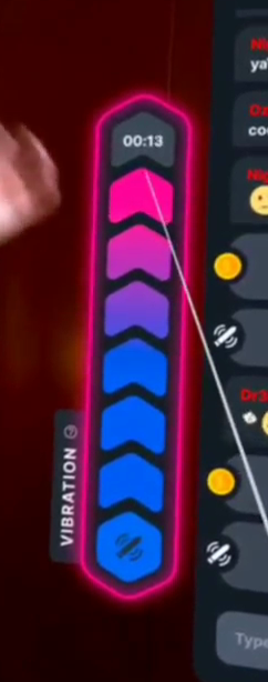
Nice touch with the progress bar for the goal ;) (A version of that has always been available as a part of the VR interface)

@Charlie_SC , I have a suggestion. Both models and users have commented on (criticised ;) ) the most recent(-ish) change to how tipping and "Epic Goal" interacts. Could it be possible to insert a similar progress bar as suggested below? At least then the existence and progress of a model's epic goal will be right in front of users during the chat, and not hidden away as it is now in her profile, where very few users "go".


View attachment 96624
 
  • Like
Reactions: Charlie_SC
Upvote 0
I've noticed when I purchase a video it doesn't say what specific video is purchased in the chat announcement. Maybe this could be changed to say the title of the video to help the model know what video was purchased and maybe advertise the video to others?

Yes, us models have suggested this to them before, because it’s really crazy to me to not let models know WHICH video has just sold. Lol.
 
Upvote 0
Nice touch with the progress bar for the goal ;) (A version of that has always been available as a part of the VR interface)

@Charlie_SC , I have a suggestion. Both models and users have commented on (criticised ;) ) the most recent(-ish) change to how tipping and "Epic Goal" interacts. Could it be possible to insert a similar progress bar as suggested below? At least then the existence and progress of a model's epic goal will be right in front of users during the chat, and not hidden away as it is now in her profile, where very few users "go".
Just realised that my screen grab doesn't seem to be viewable. So here is another version of it.

Screenshot_2023-06-10_22:49:11.png
 
Upvote 0
Yes, us models have suggested this to them before, because it’s really crazy to me to not let models know WHICH video has just sold. Lol.
the way it's worded looks like it's ment to show the title
just purchased video for 300 tokens
its like "video" is a place holder for the title otherwise it should be "purchased a video" right?
 
  • Like
Reactions: Ozzie_
Upvote 0
I don't know how practical this is from SC's perspective but I will suggest it anyway

It is always a bummer when a favorite model shuts down their account. Certainly this can be done for personal reasons, but many times it is because the model is switching studios, going independent or otherwise needing to change names but they still intend to broadcast on Strip chat

My suggestion is when an existing model creates a new account have an optional feature where the model can inform all users who had favorited the model that there is a new model they may be interested in - either just pushing to the top of "recommended" and "New models" or an actual alert like you get when someone sends or accepts a friend request. This way the model has a chance to retain their followers and start earning fast instead of starting over. The feature should suppress any users the model has banned and also give them the ability to review the list and remove any users they like (with a search feature since some models have thousands of followers but may have 1 or 2 users they really want to ditch)

I make this suggestion with the assumption that Stripchat can use the verification data automatically to know when a model is a repeat model with associated old accounts

This may be thorny because I don't know if SC bypassing the studio and taking away some of their power is a problem. As a user, I can tell you it is the actual person we like, not the account. It irritates me when studios recycle accounts.
 
  • Like
Reactions: Ozzie_
Upvote 0
A particular bug bear of mine is that guys get too much of a preview for paid videos. If they hover over them then they get a nice little preview of the video that constantly loops. Is there any way this can be changed, please? It puts guys off buying the videos when they can jerk off to those previews for free, in fact, I have had several people in my room tell me this when compaining about videos I've taken down.
 
  • Like
Reactions: yummybrownfox
Upvote 0
A particular bug bear of mine is that guys get too much of a preview for paid videos. If they hover over them then they get a nice little preview of the video that constantly loops. Is there any way this can be changed, please? It puts guys off buying the videos when they can jerk off to those previews for free, in fact, I have had several people in my room tell me this when compaining about videos I've taken down.


How can guys jerk off to tiny thumbnail previews that have a big "lock" on top? You can get a tiny idea of how the video is, sure, but there is no way guys can jerk off to them. Most other places have proper previews from the full video, in full size and without a lock icon on, some 10 or 20 seconds long, I am sure guys don't jerk off to these - in particular, I am thinking of manyvids as an example but many other places do the same. Even when I was someone that never paid for content/models, I would and could never jerk off on a 10 seconds preview, so definitely not one on SC where it's a small thumb with a big lock icon that covers the majority of the thumbnail.

Edit:
Just to add to this as well, the preview isn't a fluent preview, and by that I mean it will show a few seconds, then skip forward in the video, then show a few more seconds, then skip forward again, and show a few more seconds. So it's not like it's just 10 or 20 seconds of one part of the video.

If guys are jerking off to these then they are most likely freeloaders already so don't matter.
I just looked, and the thumbnail size is only 258x145 px, and the length is about 10 - 12 seconds.
 
Last edited:
Upvote 0
How can guys jerk off to tiny thumbnail previews that have a big "lock" on top? You can get a tiny idea of how the video is, sure, but there is no way guys can jerk off to them. Most other places have proper previews from the full video, in full size and without a lock icon on, some 10 or 20 seconds long, I am sure guys don't jerk off to these - in particular, I am thinking of manyvids as an example but many other places do the same. Even when I was someone that never paid for content/models, I would and could never jerk off on a 10 seconds preview, so definitely not one on SC where it's a small thumb with a big lock icon that covers the majority of the thumbnail.

Edit:
Just to add to this as well, the preview isn't a fluent preview, and by that I mean it will show a few seconds, then skip forward in the video, then show a few more seconds, then skip forward again, and show a few more seconds. So it's not like it's just 10 or 20 seconds of one part of the video.

If guys are jerking off to these then they are most likely freeloaders already so don't matter.
I just looked, and the thumbnail size is only 258x145 px, and the length is about 10 - 12 seconds.
Like I said, I have had guys come in to my room and tell me that's exactly what they do. The preview is only small, but they zoom into the screen so it takes up the whole page and they then have a free 12 second video they can watch on a loop. When you don't have sex with your partner live on cam and only do that through paid videos, then yes, it makes a difference.
 
Upvote 0
Like I said, I have had guys come in to my room and tell me that's exactly what they do. The preview is only small, but they zoom into the screen so it takes up the whole page and they then have a free 12 second video they can watch on a loop. When you don't have sex with your partner live on cam and only do that through paid videos, then yes, it makes a difference.
Or possibly they are just yanking your chain for reasons known only to themselves.

The thumbnail preview is almost impossible to watch, the symbol in the middle covers most of what you would want to see in order to be turned on, and as @NotYou said, it is not even a contiguous 12 seconds.

Worrying about guys who might be bashing the bishop to a disjointed 12 seconds on repeat is pointless, they will never buy a video anyway. The rest of us "need" a preview to see if the video looks like we might want to buy it as some descriptions are not very, well , descriptive.
 
  • Like
Reactions: NotYou
Upvote 0
A suggestion for a option to disable autorefresh on all pages.
When i want to visit a room, and my mouse is moving to that room, suddenly refresh page. All models rearranged. In other words model gone.
Also on my mobile if I am streaming on my phone and I make a mistake and pulldown with my thumb, it will refresh the screen and end my stream. It would be amazing if the just asked, do you want to refresh this page, instead.
 
  • Like
Reactions: Charlie_SC
Upvote 0
Hi @Charlie_SC , I have been having a problem with accepting offline private requests on mobile since the “check box to go live” was moved… basically the PVT pop-up blocks the entire screen, and we used to be able to scroll behind the pop-up to check the box and go live, but now we are unable to scroll on the page that has the box so you have to turn your phone horizontal to see it. But once you turn your phone horizontal and click start private, the system won’t let you turn your phone back vertical. This is causing me to no be able to accept offline PVT requests, I have to decline, go live, ask them to join my room, and then hope they click start PVT again. Also the box blocks the PM area on both mobile and desktop so I am unable to communicate this with them until I decline the request… very stressful
 

Attachments

  • IMG_3016.jpeg
    IMG_3016.jpeg
    286.8 KB · Views: 12
  • IMG_3017.jpeg
    IMG_3017.jpeg
    258.1 KB · Views: 12
  • IMG_3018.png
    IMG_3018.png
    1.8 MB · Views: 12
  • IMG_3067.jpeg
    IMG_3067.jpeg
    889.6 KB · Views: 12
  • Like
Reactions: Charlie_SC
Upvote 0
I don't have the statistics that SC has, but I suspect the Roulette Wheel is reasonably profitable, at least in comparison to the low-end stream of tips.

It's also a lot more interactive, and interesting (depending on the model's choices) from a customer's point of view. There's a chance you'll get something simple, or something that causes the model to get up and engage with the audience.

So, a Roulette Wheel in VR would be appreciated. It's got to the point where I'll have the desktop site open on a laptop, while wearing VR, which breaks the immersion quite a bit.

It doesn't even have to be a full spinning wheel. It could be a rotating cylinder, slot machine style, with the text printed on it. Or even just a "Spinnning...." text, that's replaced with the outcome.

Could this be considered please?
I would second this.

In truth the VR interface lacks a *lot*.

Typing is painful (although I cannot see any way around that), the voice to text really can't cope with my Aussie accent 50% of the time, and as @qiaonasen says, many things from the 2D interface like roulette wheel, Battleships, Polls, Epic goal interface are not available in VR.

Also, as a Knight, I cannot mute or report users from the VR interface.
Likewise, users cannot be "tagged" in chat to respond to them specifically as can be done in 2D by merely clicking on their name.

The roulette wheel, if priced "well" with regard to the prizes offered, I have seen to be a very popular with users. but again, in VR, we cannot access it. Could an interface to both Roulette Wheel and the Epic Goal be placed below this arrangement of buttons?

The "Instant Tip" interface is a quite recent addition,so presumably the interface is not set in stone.
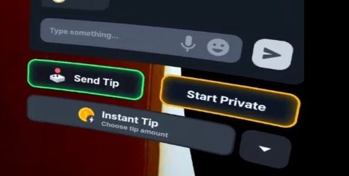
1688454663527.png

"Direct" Lovense control (not tip reaction) by a VR user is impossible also, but I suspect that is in Lovense's court as it is more about the control interface being a 2D page from the Lovense site.

I know the support for and development of the VR interface is no doubt complex, but SC does extract an *extra* premium from the models who stream in VR over and above the standard "50%" cut they take from all, so.... maybe making it easier for VR users to spend our tokens on things like Roulette and Epic goals woudl be good for both models and the site?
 
  • Like
Reactions: Charlie_SC
Upvote 0
Hey @qiaonasen
Thank you for your feedback.
We love hearing from our models, especially when it's in regard to improving our platform.
We are working hard this year on many things and VR is one of them so stay tuned with our updates, as I believe we're all on the same page regarding the upcoming improvements 🤗

Hi @Ozzie_
Love the thorough feedback and explanations.
(and just for the record, it's not just computers who have trouble with the Oz accent.. it's a problem in everyday life too!) :giggle:


🥰
I know I say this often but we really do appreciate and value our models and users' thoughts/feedback.
Thanks guys!
🥰
 
  • Like
Reactions: Ozzie_
Upvote 0
Hi @Ozzie_

(and just for the record, it's not just computers who have trouble with the Oz accent.. it's a problem in everyday life too!) :giggle:
Oh I know!!!

I actually gave up sending voice messages to my friend to help her with her English pronunciation when she sent back her effort after listening to me and she sounded like Paul Hogan on Mogadon!!!!! Actually, it was more like the worst actor trying to sound like an Aussie. (Think Meryl Streep's accent in "Evil Angels" / "A Cry in the Dark" :arghh: )

(I do not think my accent is that strong, but obviously it is 😭 :rofl: )
 
  • Funny!
Reactions: Charlie_SC
Upvote 0
I'd like to see more options to report users quickly and easily.
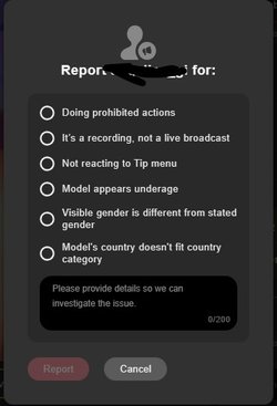
Currently there is a myriad of options/reasons to report a model from right within the room but to report a user, the only two choices are
'malicious links, spam' or 'hate speech, threats'.

What about users claiming to be minors, talking about incest, pedophilia, rape, bestiality and on and on?
Currently you would have to take screenshots, note the users name, the models room, gather all this and craft a message to support sending all your documentation... Not quick nor easy.
I believe all of these hurdles let the "bad actor" users continue what they are doing.
Granted, the vast majority of these are grey users but often the model has their chat set up so they don't even see messages from greys and therefore are unaware of the violations happening.

Examples:
Report a model actions:
Screenshot 2023-07-05 142842.jpg

Report a user actions:
Screenshot 2023-07-05 142944.jpg
 
Upvote 0